Where would my sense of humour be if I didn’t write a contrasting piece to the one about Google’s People Chips with one about Mega Burgers?
In reality this is a piece about the difference between mega menus and burger menus.
These are both navigation design components that drive people to distraction. Love them or loathe them, they’re not going away any time soon.
Mega menus
I’m going to rock the boat and say I really like a well designed mega menu.
I like a mix of labelling, visual cues and contextual content. It makes navigating through things a lot easier.
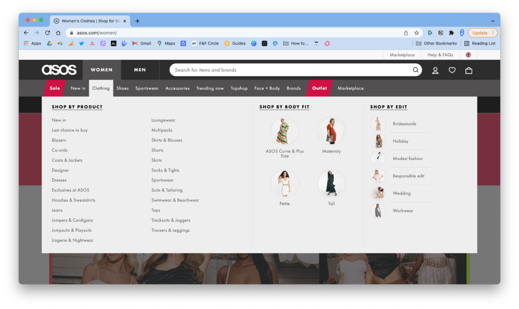
This is what a mega menu looks like:

There are no hard and fast rules of what a mega menu should be, but it can include the following:
- Navigable links to sub-sections of the primary (seen above as links to clothing sections)
- Facets that control aspects of a sub-page for example narrowing down to size or style on clothing sites
- Curated content as shown above by body fit and edit
- Advertising or topical content
A mega menu allows people who want to browse the ability to do so, whilst helping them to get to information or content that is specifically relevant to their needs.
The problem with mega menus is that they need to be maintained. They are not the kind of thing you can just created. They need to be curated.
Burger menus
While I love a good mega menu, the thing that drives me nuts are burger menus. For the uninitiated, a burger menu is actually the call to action that triggers opening a menu. It’s a three line icon that is all over the place in the header.
It’s also as much use as a chocolate teapot half the time. While we (aka the people who design them) know what they are and where they are. The majority of people who use mobile websites, don’t know or struggle to find them.
Let’s have a look at a couple of examples of why this is problematic.
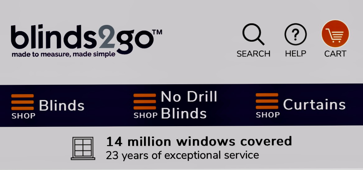
First up, Blinds2Go. I honestly don’t even know where to start with this.
Not one, not two but THREE burger menu icons with labels. FML.
Aside from that, I have absolutely no idea if I’m navigating three separate sections of the site or if they’re filters.
They would have gotten top marks if they’d just dropped the bloody icons. Sigh.

The next one is something I see all to frequently.
I’m not going to rehash what others have written so eloquently, so have a look at this great article from Smashing Magazine about the topic of designing around thumb patterns.

I will say that if we want people to know and understand what a burger menu call to action is, and what it does, we should be consistent in where we put it.
Moving it around all over the screen, top left, top right, in the middle, below the header or somewhere else, does not help our cause.
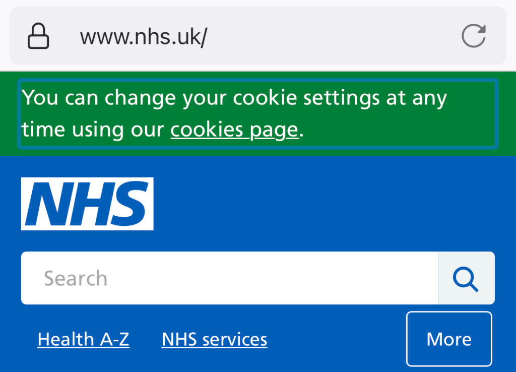
I will finish with an example that I know does work, because I worked on the team that implemented it (I had only small involvement, the credit goes to the rest of the IA team).
Why does it work? It’s obvious to the person using the site what the options are.
We have conditioned people that when navigating a website they look for primary labels. When you take them away, you have a problem.
I have plans to publish what I believe will be a perfect mobile navigation design pattern soon.

